TUWHIRI Research Initiative Brand Identity
Te Whai Ao - Dodd-Walls Centre / University of Otago
A logo suite and light visual identity for a new photonics and atmospheric science research initiative at Te Whai Ao - Dodd-Walls Centre, delivered alongside a design-level review of two bilingual candidate names ahead of the 19 July 2026 kickoff.
Role
Deliverables
- Design-level name direction check across TUWHIRI and ARONUI
- Up to three initial logo concepts exploring ozone, molecule and optical forms
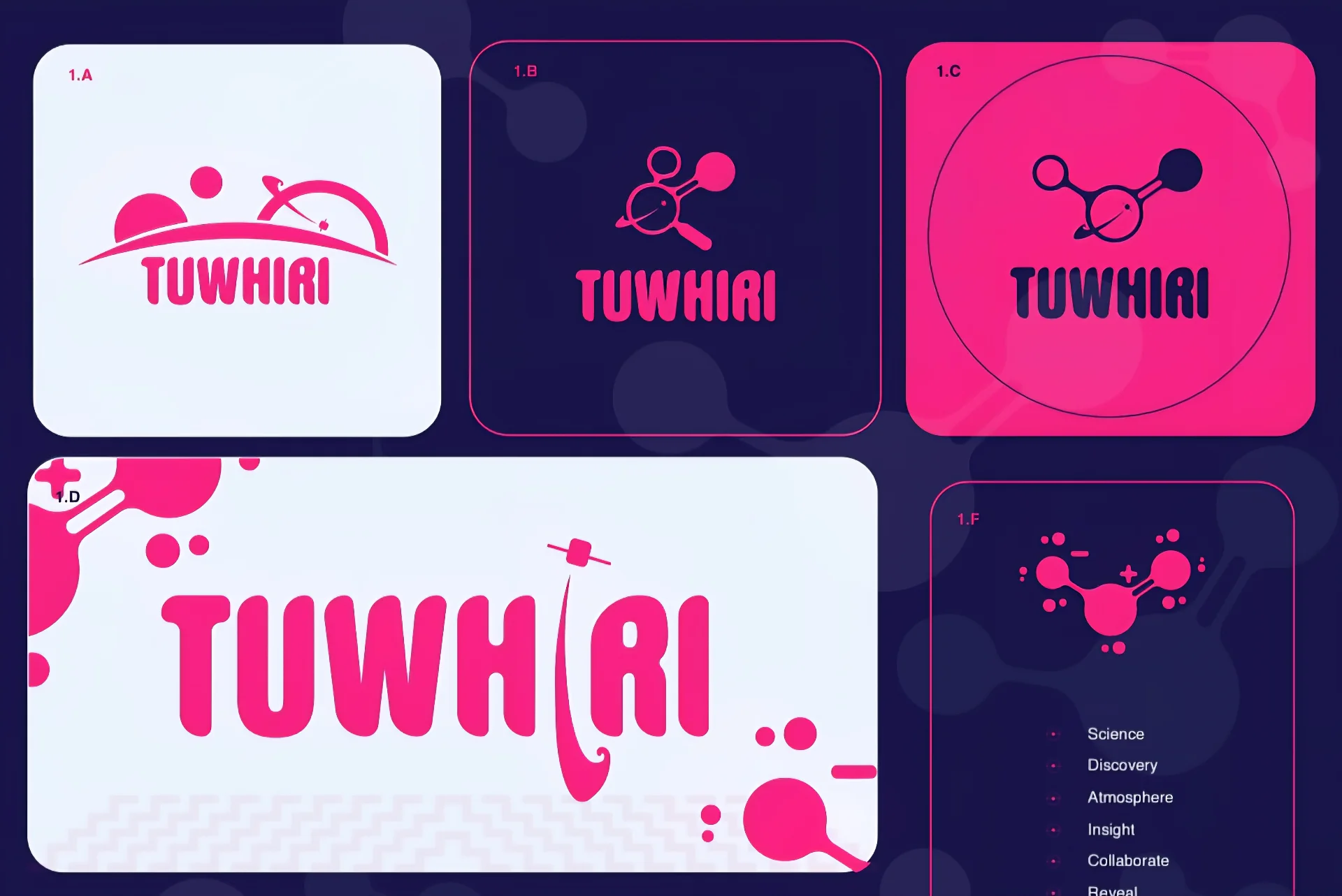
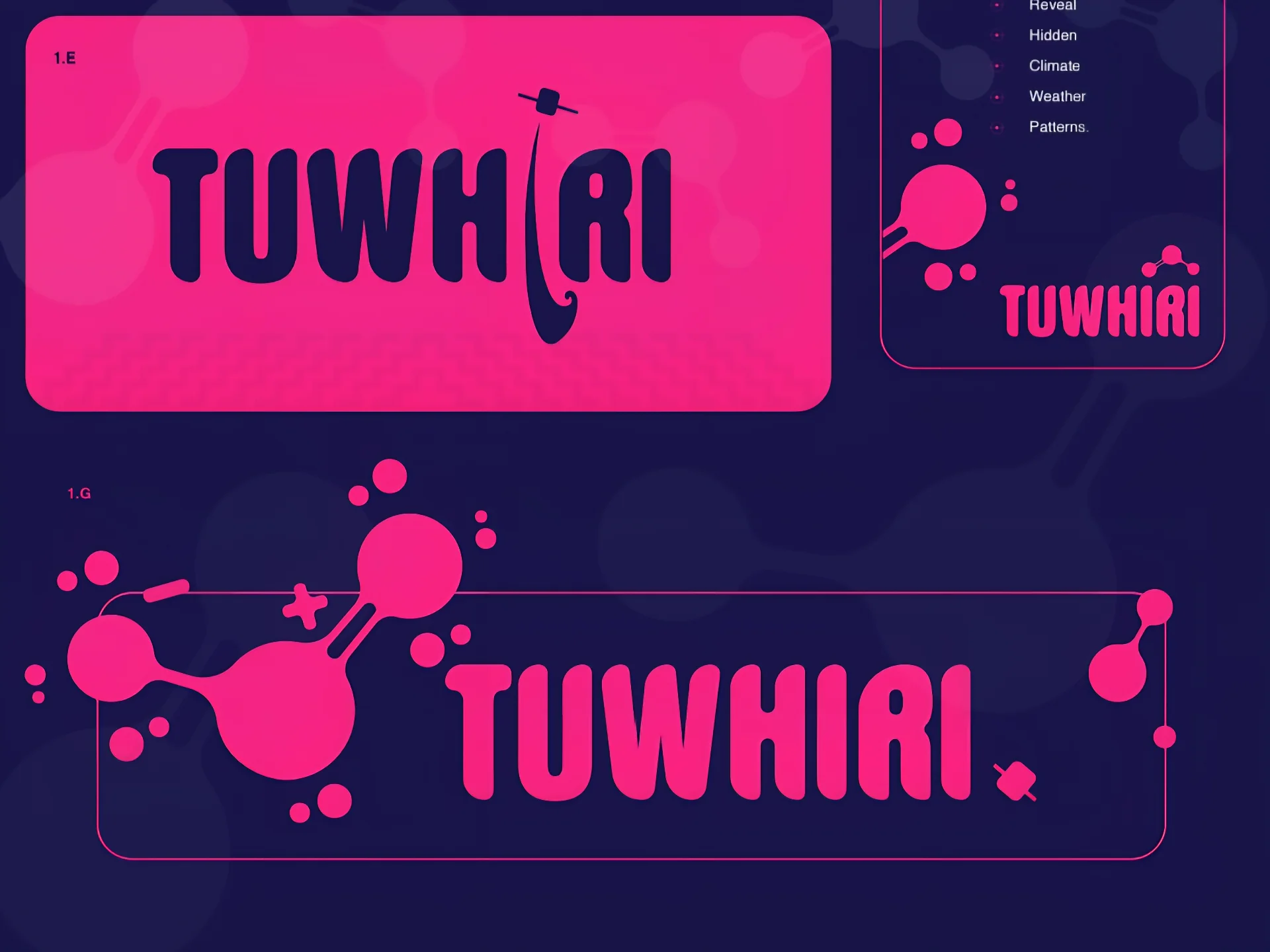
- Final logo suite - primary, horizontal, stacked, icon-only, one-colour and reversed
- Accessible colour palette and typography direction
- Print-ready pin and sticker files (vector, transparent PNG, PDF)
- Mini brand sheet with usage notes and small-format guidance
Outcome
A resolved, culturally reviewed identity delivered ahead of the kickoff meeting - built on the ozone molecule and the initiative's three-part collaborative structure, with production files supplied directly to pin and sticker supplier specification.
Project Overview
Te Whai Ao - Dodd-Walls Centre is one of New Zealand's leading photonics and quantum science research centres, operating in partnership with the University of Otago and a network of engineering, atmospheric science, and photonics collaborators. In mid-2026 the centre launched a new research initiative focused on terahertz upconversion, weather-based hazard insight, ozone detection, and atmospheric science - requiring a distinctive brand identity ahead of its 19 July 2026 kickoff meeting.
The project team was deciding between two candidate names: TUWHIRI (Terahertz Upconversion for Weather-based Hazard Insight and Resilience Initiative), carrying the meaning of disclosing or revealing what is hidden; and ARONUI (Atmospheric Resonant Optics with Novel Upconverting Instrumentation), carrying associations of focus and deep attention, as well as connection to the kete of knowledge. Both names were bilingual in intent - functioning simultaneously as scientific acronyms and te reo Māori concepts - requiring careful cultural and design-level review before commitment.
The brief was urgent: a professionally resolved logo and light visual identity approved and prepared for launch collateral including pins and stickers within a two-to-three-week window. Māui Studios was engaged to deliver a focused brand package communicating science, discovery, atmospheric insight, and the revealing of hidden climate and weather patterns - with an accessible palette and a warm, kaupapa-driven tone suited to a collaborative, multi-disciplinary research environment.
SOW Snapshot
Stages: Kickoff and direction; concept design; refinement; final artwork; handover.
Core Deliverables: A name direction check reviewing both TUWHIRI and ARONUI across tone, cultural appropriateness and creative risk; up to three initial logo concepts exploring ozone and molecule forms, the three-team collaborative structure, and optical and atmospheric cues; one selected concept refined into a final logo suite (primary, horizontal, stacked, icon-only, one-colour, reversed); a colour palette; typography direction; print-ready pin and sticker files (vector, transparent PNG, PDF); and a mini brand sheet consolidating logo variations, colour, usage notes and small-format guidance.
Client Contact: Jessa Barder.
Format: Logo suite, colour palette, typography direction, mini brand sheet, print-ready production files.
Timeline: 2-3 weeks from deposit; final files delivered ahead of the 19 July 2026 kickoff.
Service Connection: Visual Design, Brand Identity, Cultural Consultation, Strategic Communication.
Outcomes
Māui Studios conducted a design-level name direction review assessing both TUWHIRI and ARONUI across cultural tone, creative potential and practical risk - giving the project team a clear recommendation to inform their final naming decision. The review surfaced important considerations around the deeper cultural associations of ARONUI and its connection to the kete of knowledge, ensuring the team could proceed with informed consent rather than inadvertent appropriation.
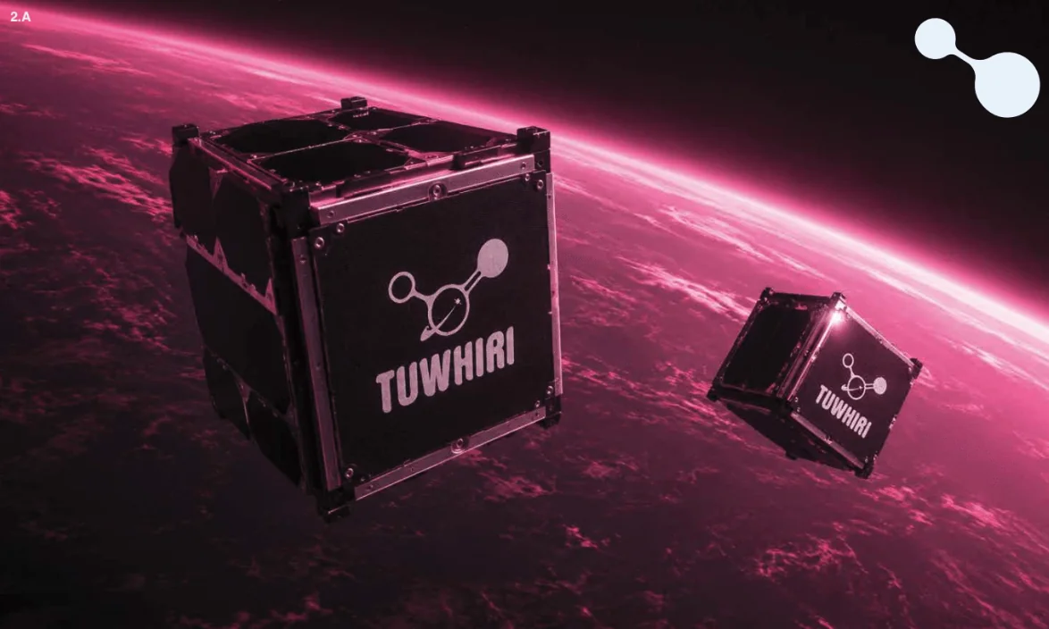
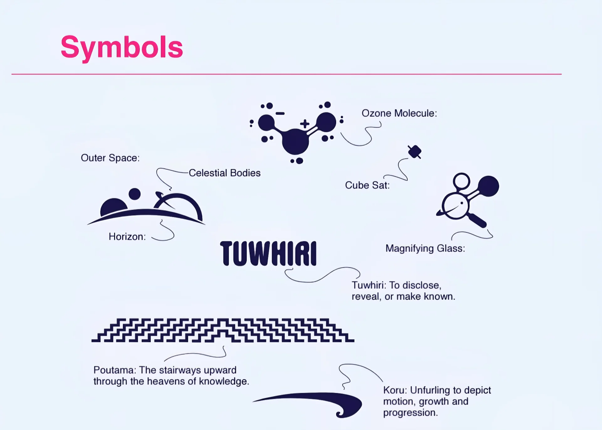
The final logo system was built around the selected name direction, drawing on the ozone molecule as a core scientific motif and the three-part collaborative structure of engineering, atmospheric science and photonics as an organising visual principle. Supporting symbols - the horizon, celestial bodies, a cube sat, a magnifying glass, poutama and koru - carry the kaupapa of revealing what is usually unseen.
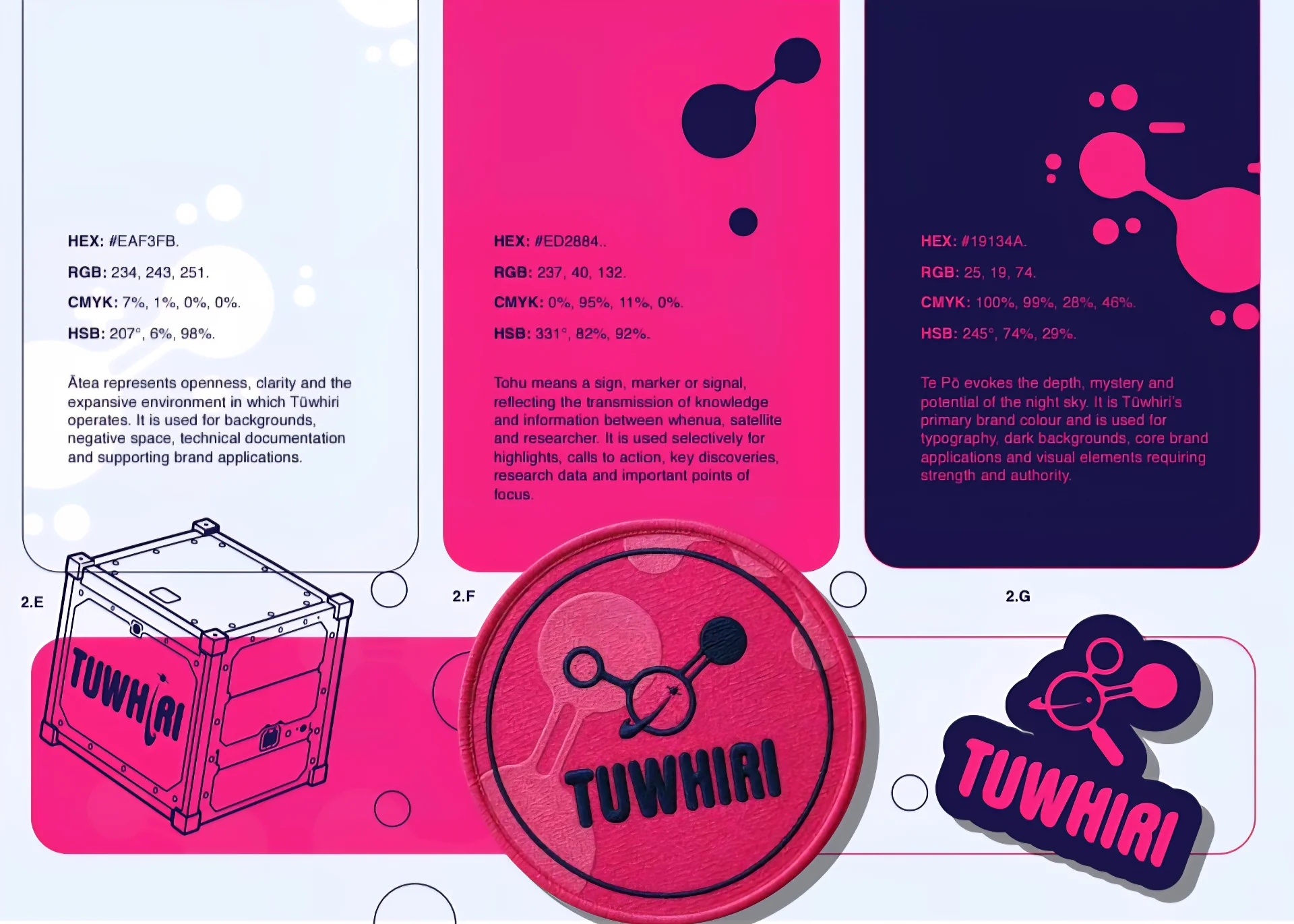
The palette was developed with accessibility in mind: Ātea | Orbital Light (#EAF3FB) for openness and technical documentation, Tohu | Signal Magenta (#ED2884) for highlights, calls to action and key discoveries, and Te Pō | Deep Space Indigo (#19134A) as the primary brand colour for typography, dark backgrounds and elements requiring strength and authority. Typography direction (Helvetica Bold and Regular) reinforced scientific clarity without sacrificing approachability.
Production files were prepared to supplier specification for pin and sticker production, with the mini brand sheet providing a single-page reference for consistent application across launch collateral and beyond.
Impact Metrics
Intended Outcomes
- A resolved, professionally credentialled brand identity in advance of the 19 July 2026 kickoff, enabling confident launch collateral production on schedule
- Reduced cultural and reputational risk around bilingual scientific acronym naming, particularly ARONUI's connections to mātauranga Māori
- A visual language capable of representing three collaborating teams without privileging any single discipline
- Print-ready files delivered directly to supplier specification, removing a production friction point
Broader Impact
- Research branding plays a documented role in public and institutional communication of science. New Zealand's National Science Challenges and MBIE-funded initiatives increasingly require coherent brand identities to support stakeholder engagement, public communication and cross-institutional collaboration (Ministry of Business, Innovation and Employment, 2022).
- The use of te reo Māori in scientific naming aligns with both the Crown's Māori Language Strategy and the science sector's commitments under Te Tiriti o Waitangi, making careful cultural review of bilingual acronyms a necessary rather than optional step in responsible research branding (Te Taura Whiri i te Reo Māori, 2019).
Future Opportunities
- A full brand guidelines document extending beyond the mini brand sheet to cover digital application, presentation templates and report formatting
- Motion-based identity assets for conference presentations and digital platforms, drawing on the atmospheric and optical visual language
- Translation of complex scientific findings into accessible public-facing media as the initiative's outputs grow
- Ongoing creative partnership across the New Zealand photonics and science research sector, where rigorous scientific communication, accessible visual design and te ao Māori cultural competency remain a rare combination
References
- Ministry of Business, Innovation and Employment. (2022). Te Ara Paerangi - Future Pathways: New Zealand Research, Science and Innovation System Review. New Zealand Government.
- Te Taura Whiri i te Reo Māori. (2019). Maihi Karauna: The Crown's Strategy for Māori Language Revitalisation 2019-2023. New Zealand Government.
- Te Whai Ao - Dodd-Walls Centre. (2026). About Te Whai Ao. University of Otago. https://www.dodd-walls.ac.nz/
- Māui Studios Aotearoa Ltd. (2026). Statement of Work: TUWHIRI / ARONUI Project Logo Design. Internal document.