← Case Studies

Discipline

Māori Graphic Design

Māui Studios does Māori graphic design as a discipline of its own — brand identity, design systems, wayfinding, print, publication, environmental graphics and toi Māori pattern development. Every project starts with kōrero about the kaupapa, the story owners and the appropriate design language: whose kōwhaiwhai, whose tukutuku, whose whakairo motifs are we drawing on, and under what permission. We design brand systems for iwi entities, cultural precincts and Māori businesses; we build publication and typographic systems for te reo Māori books and reports; and we develop bespoke pattern languages that hold up across print, screen, environmental and digital-product contexts. Selected work includes the Mana Tāhuna brand, Te Ao Matihiko tohu, the Ko Māui Hangarau identity and character design system, Ngāti Ranginui web design, and Barnardos Whare Manaaki.

Selected Māori Graphic Design work

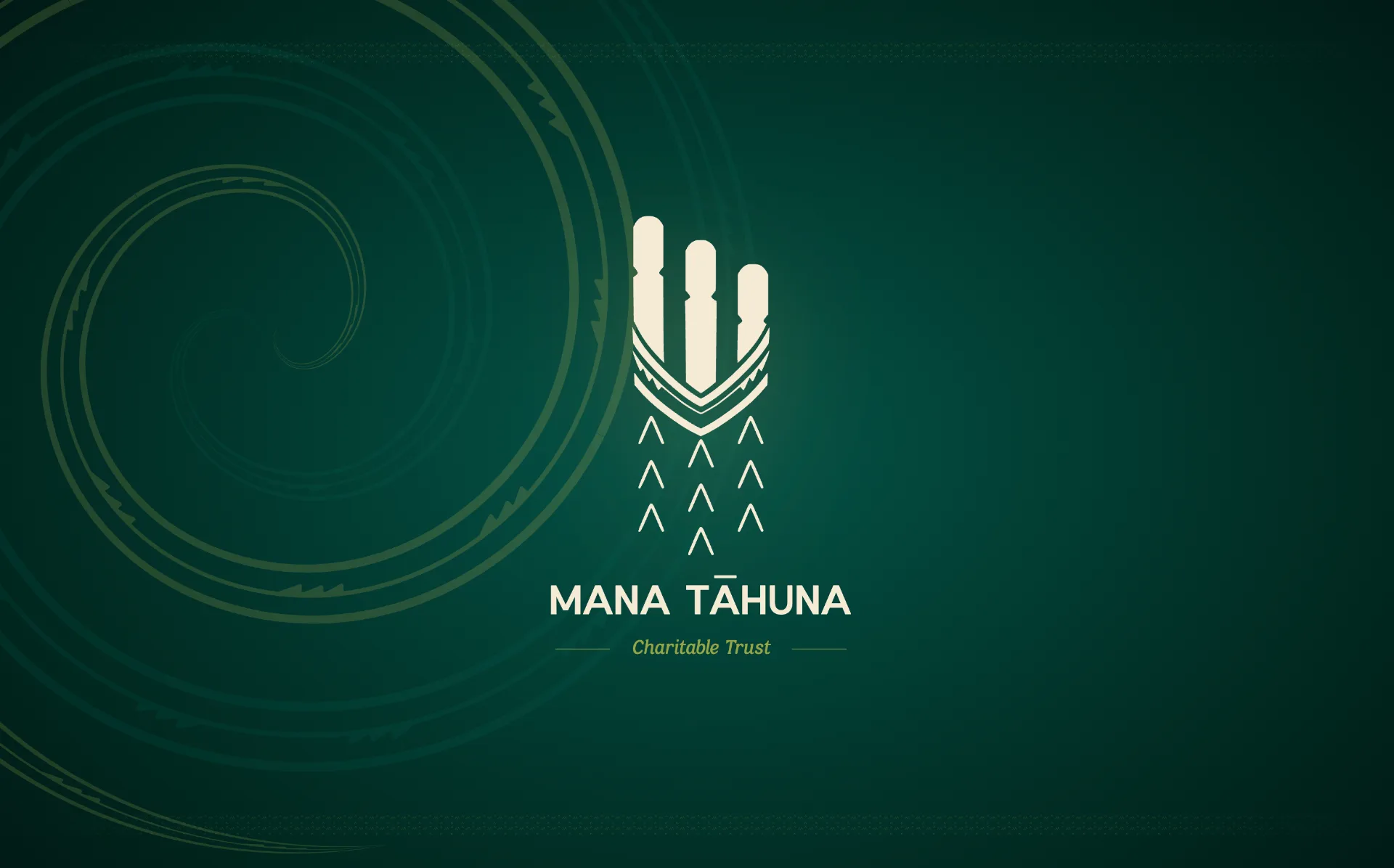
Mana Tāhuna primary tohu - cream pouwhenua and korowai mark on deep whenua teal with kōwhaiwhai spiral
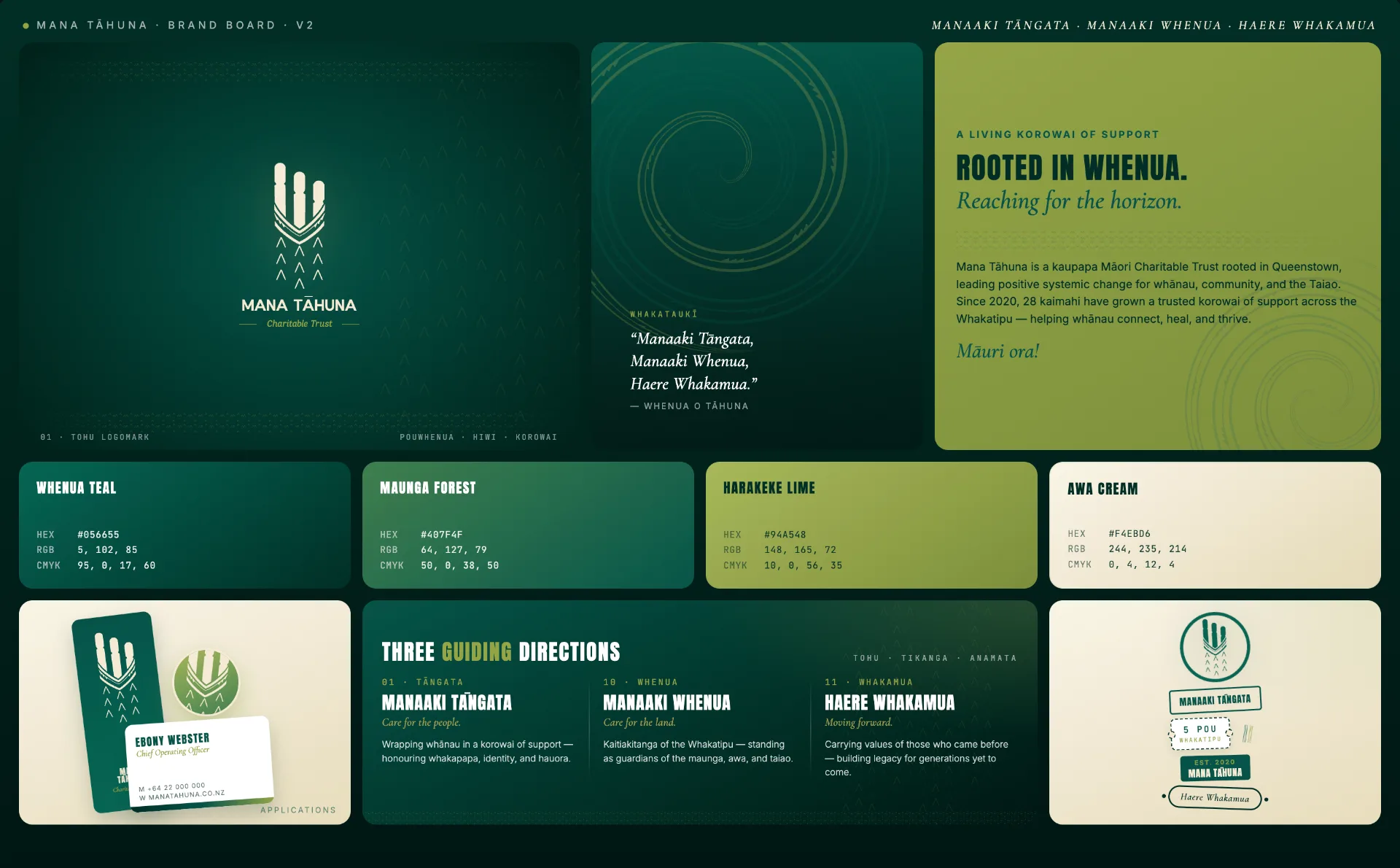
Mana Tāhuna brand board v2 - logomark, whakataukī, korowai narrative, colour palette, business card application, and three guiding directions
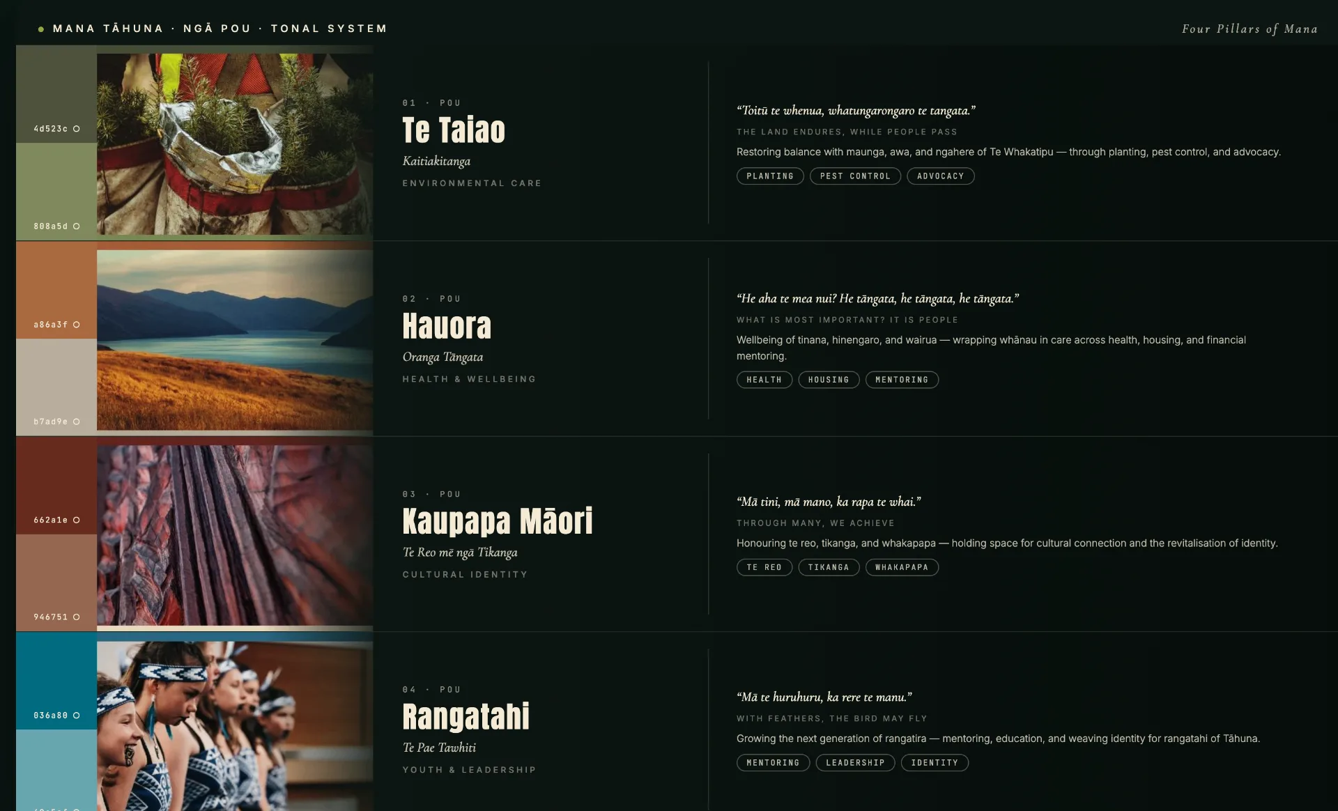
Mana Tāhuna ngā pou tonal system - Te Taiao, Hauora, Kaupapa Māori, and Rangatahi pillars with paired photography and per-pou colourways
Brand Identity + Toi Māori Design

Mana Tāhuna Charitable Trust

A renewed visual identity and brand system for Mana Tāhuna Charitable Trust - a kaupapa Māori organisation rooted in Tāhuna (Queenstown), Whakatipu. Grounded in te ao Māori and the whenua, the system carries five distinct pou within one coherent brand language.

Role

Brand IdentityToi Māori DesignVisual DesignIP & Story DevelopmentStrategic Communication

Deliverables

  • Primary tohu drawing together pouwhenua, the hiwi of the waka taua, and the korowai
  • Wordmark, full lockup, and standalone logomark
  • Primary colour palette with monochromatic treatments and typography system
  • Per-pou colourways for Te Taiao, Hauora, Kaupapa Māori, and Rangatahi
  • Brand collateral - letterhead, digital watermark, pull-up banners, email signature, display picture, favicon
  • Brand guidelines deck with alternative layouts and image-treatment guidance

Outcome

A cohesive kaupapa Māori brand system that honours whakapapa and place while signalling growth - flexible enough to express the trust's five pou through dedicated colourways, and ready for application across letterheads, banners, digital channels, and signage.
Read full case study
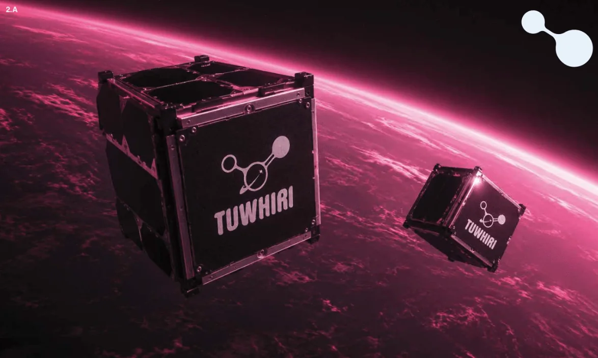
TUWHIRI cube satellites in orbit above a magenta-lit Earth, with the Ātea, Tohu and Te Pō colour names below
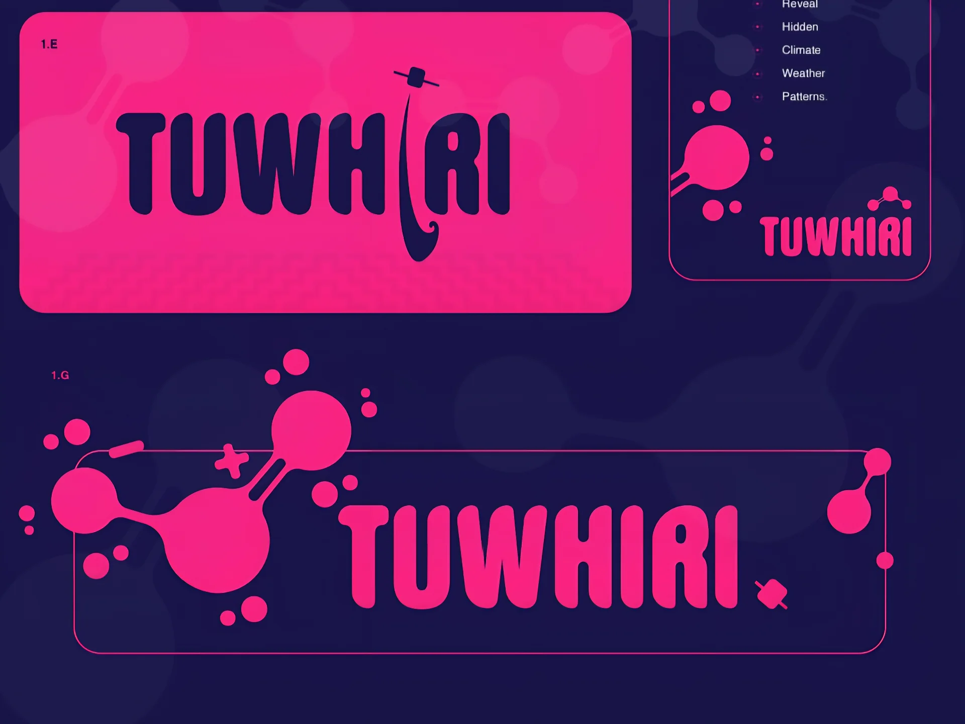
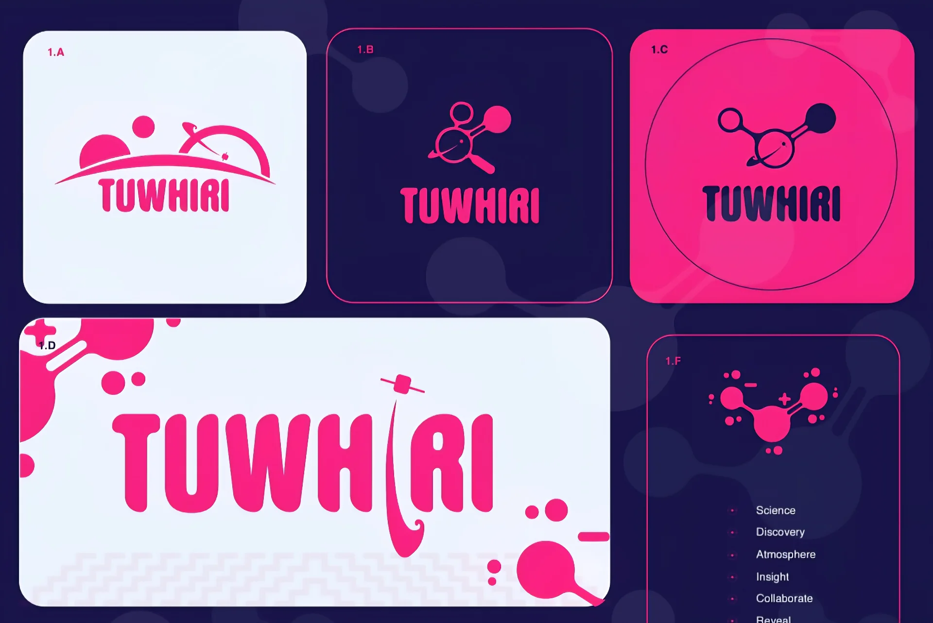
TUWHIRI logo suite - horizon, molecule, magnifying glass and stacked lockups across light, magenta and indigo backgrounds
TUWHIRI wordmark detail - indigo lockup on Signal Magenta with poutama pattern, and the full molecule lockup reversed on deep indigo
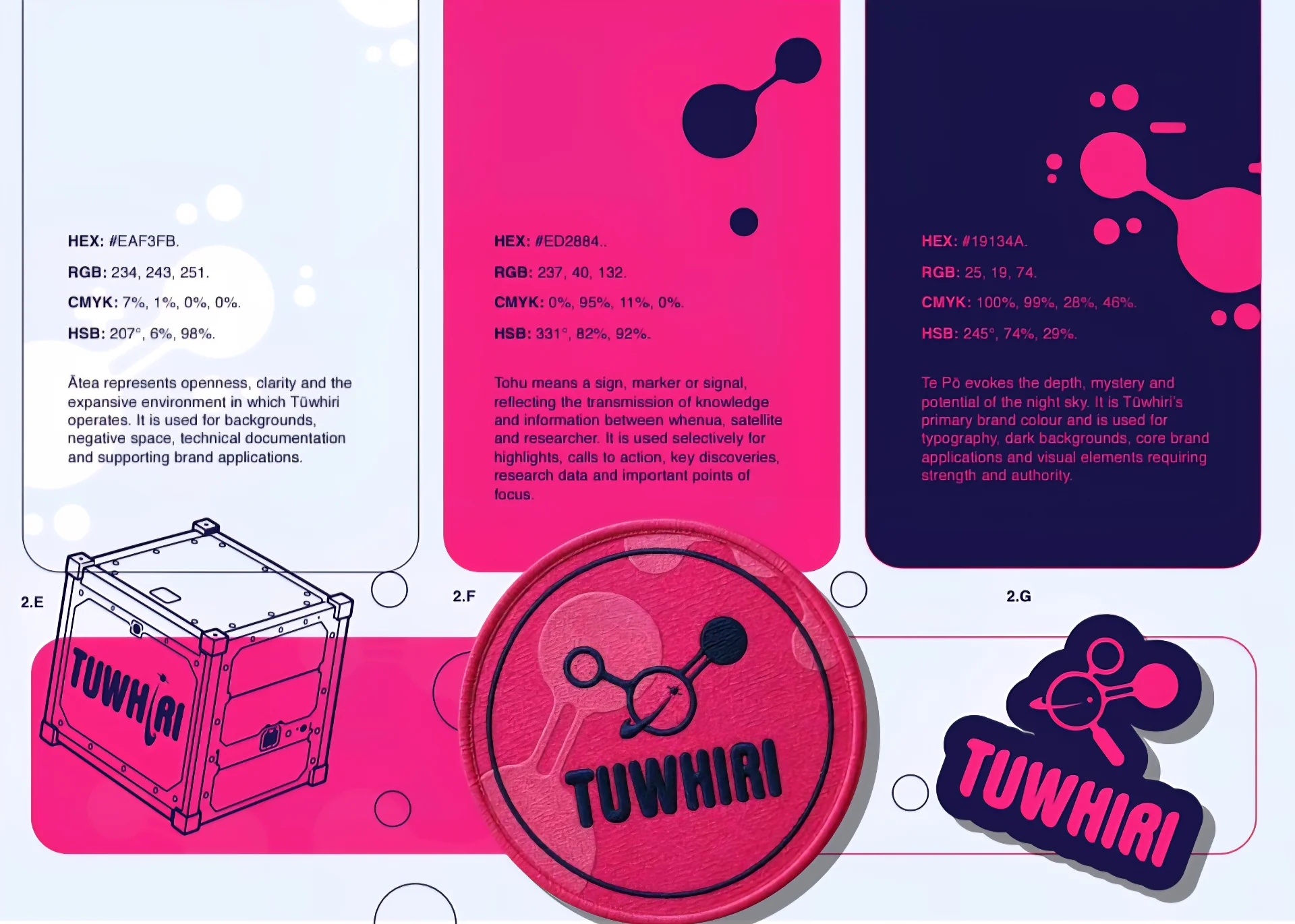
TUWHIRI colour palette - Ātea Orbital Light, Tohu Signal Magenta and Te Pō Deep Space Indigo with hex, RGB, CMYK and HSB values, plus cube sat, patch and sticker applications
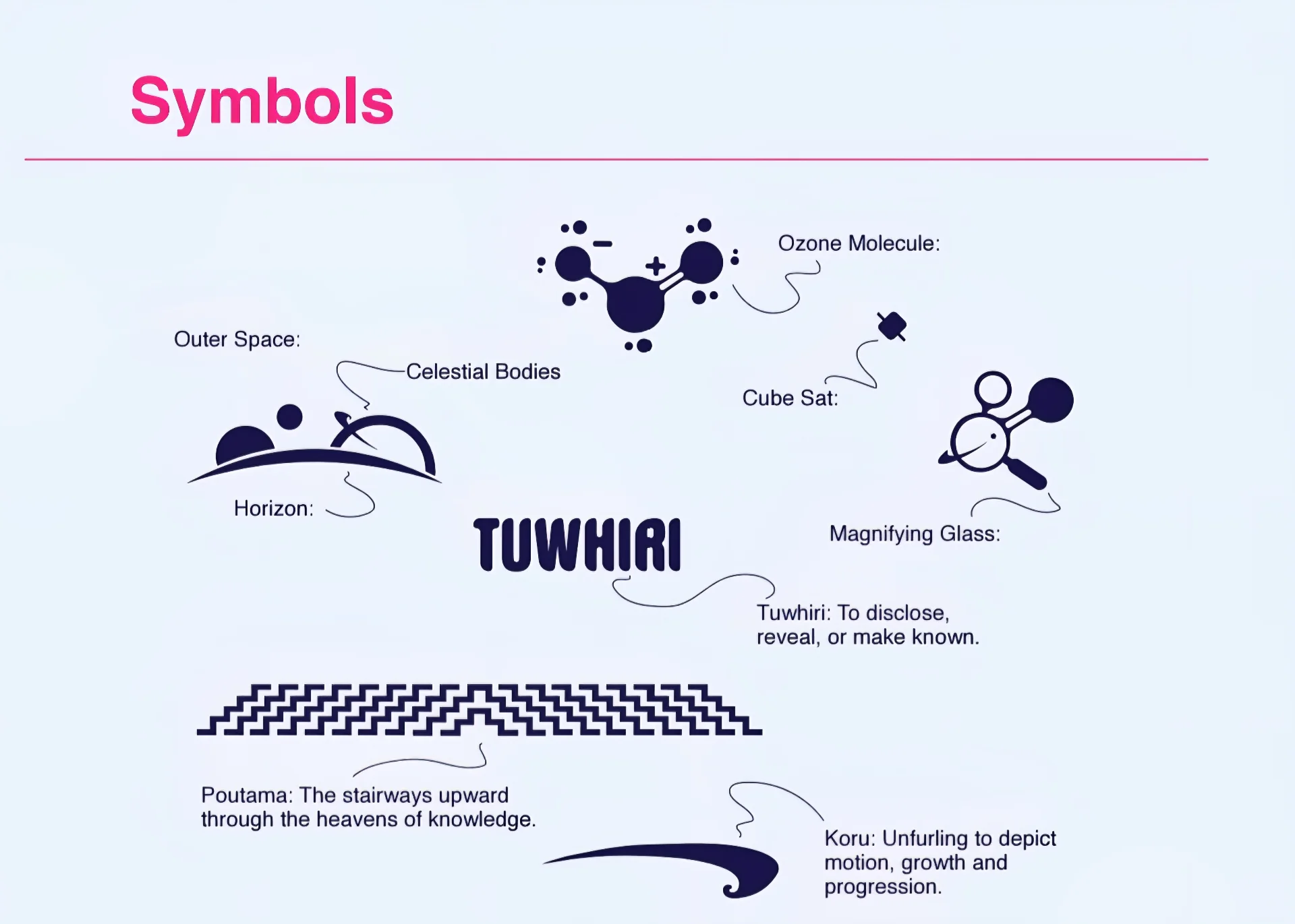
TUWHIRI symbol breakdown - ozone molecule, outer space horizon, celestial bodies, cube sat, magnifying glass, poutama and koru
Brand Identity + Science Communication

Te Whai Ao - Dodd-Walls Centre / University of Otago

A logo suite and light visual identity for a new photonics and atmospheric science research initiative at Te Whai Ao - Dodd-Walls Centre, delivered alongside a design-level review of two bilingual candidate names ahead of the 19 July 2026 kickoff.

Role

Brand IdentityName Direction ReviewCultural ConsultationVisual DesignPrint Production

Deliverables

  • Design-level name direction check across TUWHIRI and ARONUI
  • Up to three initial logo concepts exploring ozone, molecule and optical forms
  • Final logo suite - primary, horizontal, stacked, icon-only, one-colour and reversed
  • Accessible colour palette and typography direction
  • Print-ready pin and sticker files (vector, transparent PNG, PDF)
  • Mini brand sheet with usage notes and small-format guidance

Outcome

A resolved, culturally reviewed identity delivered ahead of the kickoff meeting - built on the ozone molecule and the initiative's three-part collaborative structure, with production files supplied directly to pin and sticker supplier specification.

Read full case study
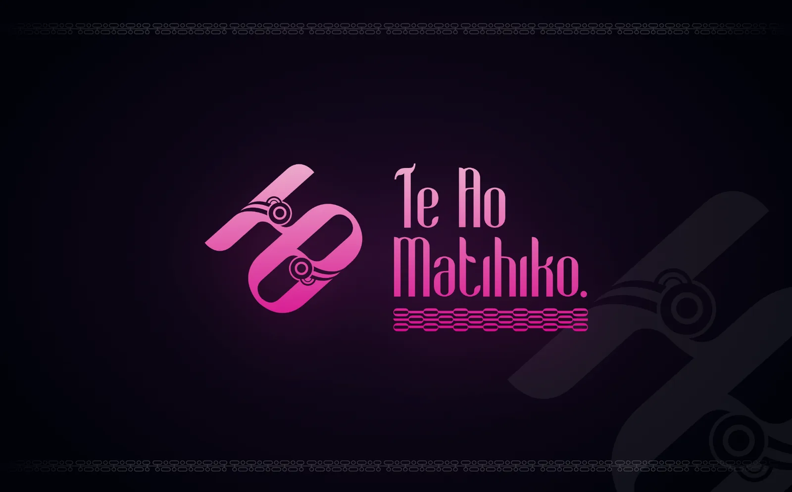
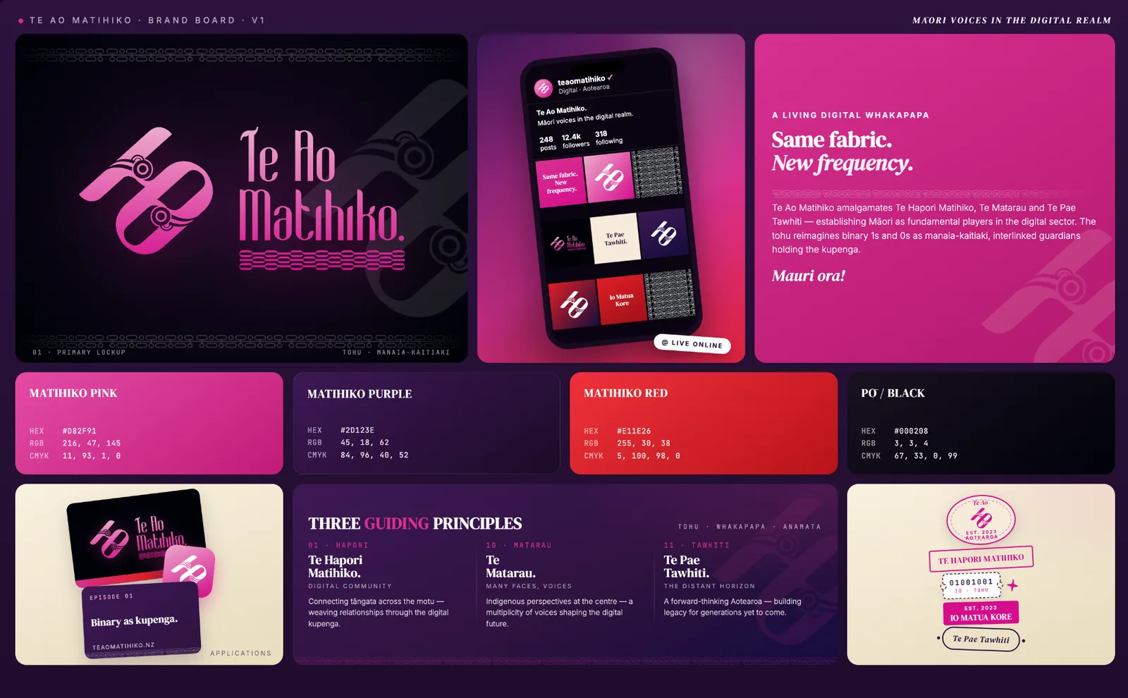
Te Ao Matihiko primary lockup - manaia-kaitiaki tohu and wordmark on a Pō black ground
Te Ao Matihiko brand board v1 - primary lockup, applications, colour system, and three guiding principles
Cultural Brand Identity

Te Ao Matihiko

A master brand tohu unifying three kaupapa - Te Hapori Matihiko, Te Matarau, and Te Pae Tawhiti - into one culturally grounded, future-facing identity that positions Māori as fundamental players in Aotearoa's digital sector.

Role

Tohu DesignBrand IdentityVisual DesignStrategic CommunicationCultural Storytelling

Deliverables

  • Master brand tohu and visual identity direction
  • Conceptual narrative framework binding three kaupapa into one whakapapa
  • Facilitated wānanga sessions with the Te Ao Matihiko leadership
  • Cross-platform application guidance - social, digital, and print
  • Colour system: Matihiko Pink, Matihiko Purple, Matihiko Red, and Pō / Black

Outcome

A recognisable, culturally authoritative master brand that unifies three kaupapa streams into one coherent visual narrative - a living digital whakapapa expressed through a manaia-kaitiaki tohu, a confident wordmark, and a versatile colour system.

Read full case study
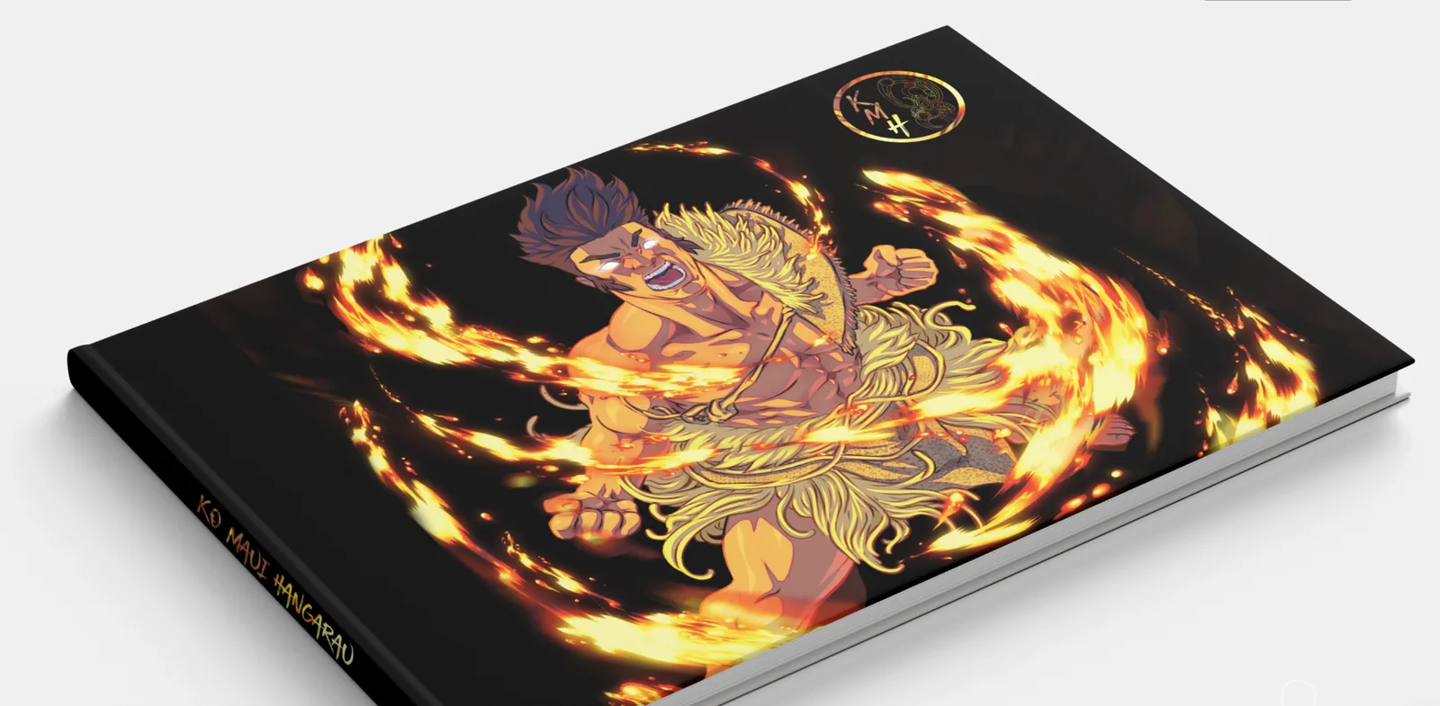
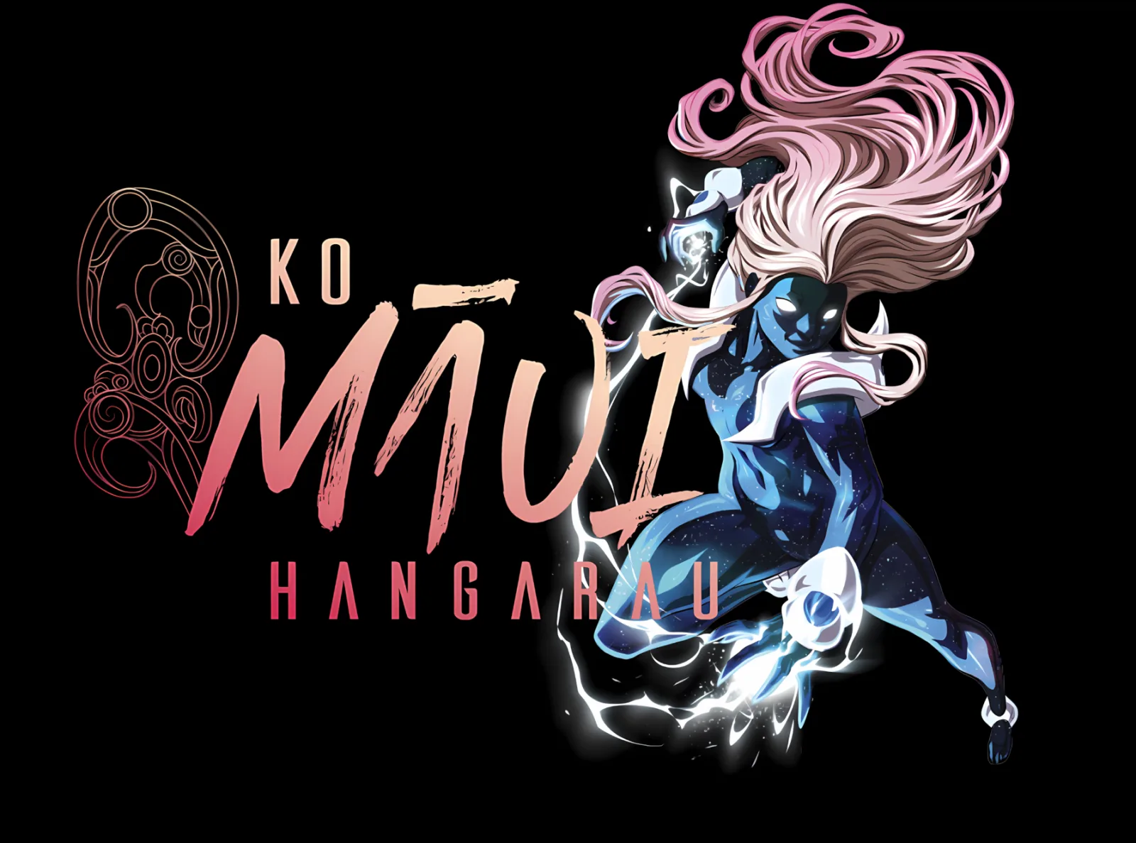
Ko Māui Hangarau book cover - Māui wreathed in fire with KMH gold monogram
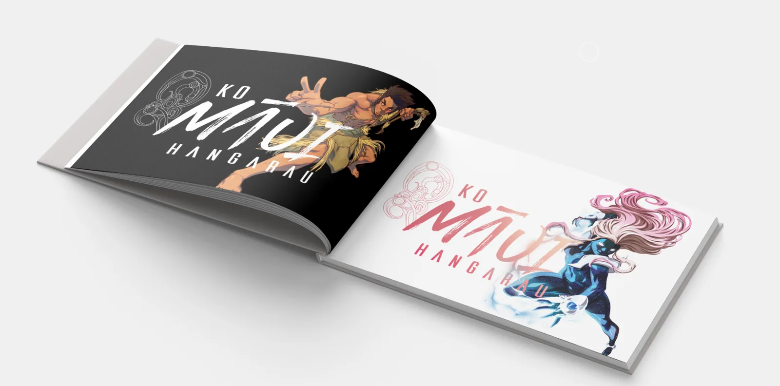
Open book spread showing Māui and Waihiko character lockups with brush wordmark
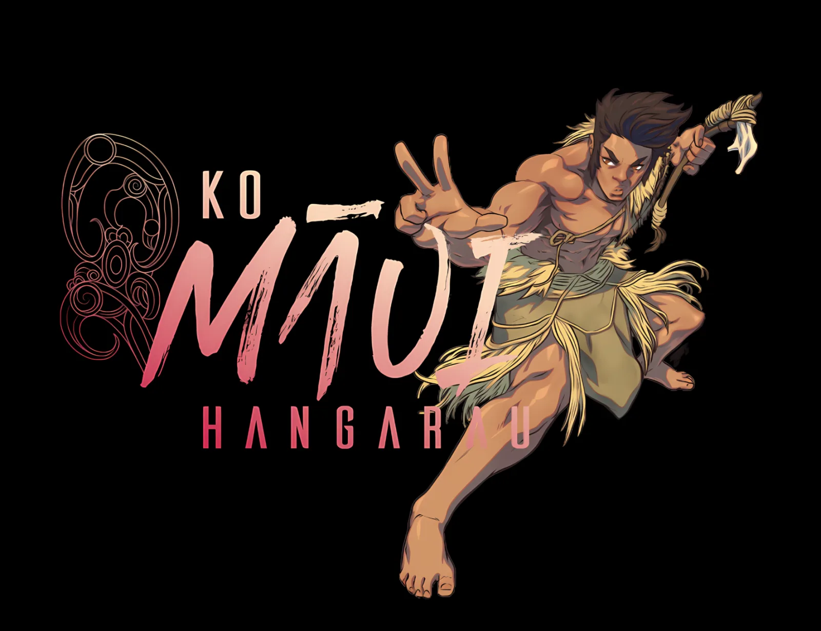
Ko Māui Hangarau brand key art - Māui warrior with brush wordmark
Ko Māui Hangarau brand key art - Waihiko elemental figure with brush wordmark
Brand Identity + Character Design

Toi Kai Rawa Trust · Ministry of Education

Brand identity, character design and visual system for Ko Māui Hangarau - a high-powered tech and innovation summit programme for rangatahi Māori delivered with Toi Kai Rawa Trust and the Ministry of Education. Sharp enough for the tech sector, unmistakably Māori in every touchpoint.

Role

Brand IdentityCharacter DesignVisual DesignIP & Story DevelopmentStrategic Communication

Deliverables

  • Brand identity system for Ko Māui Hangarau
  • Character design - Māui and Waihiko
  • Typography and wordmark using organic brush styling
  • Sleek visual design system for event and programme application
  • Brand application across summit, digital, and education touchpoints

Outcome

A distinctive, culturally grounded brand identity - Māui and Waihiko as character anchors, an organic brush typographic system, and a sleek visual system - capable of carrying the programme across summits, partner channels, education touchpoints, and digital deployment.

Read full case study
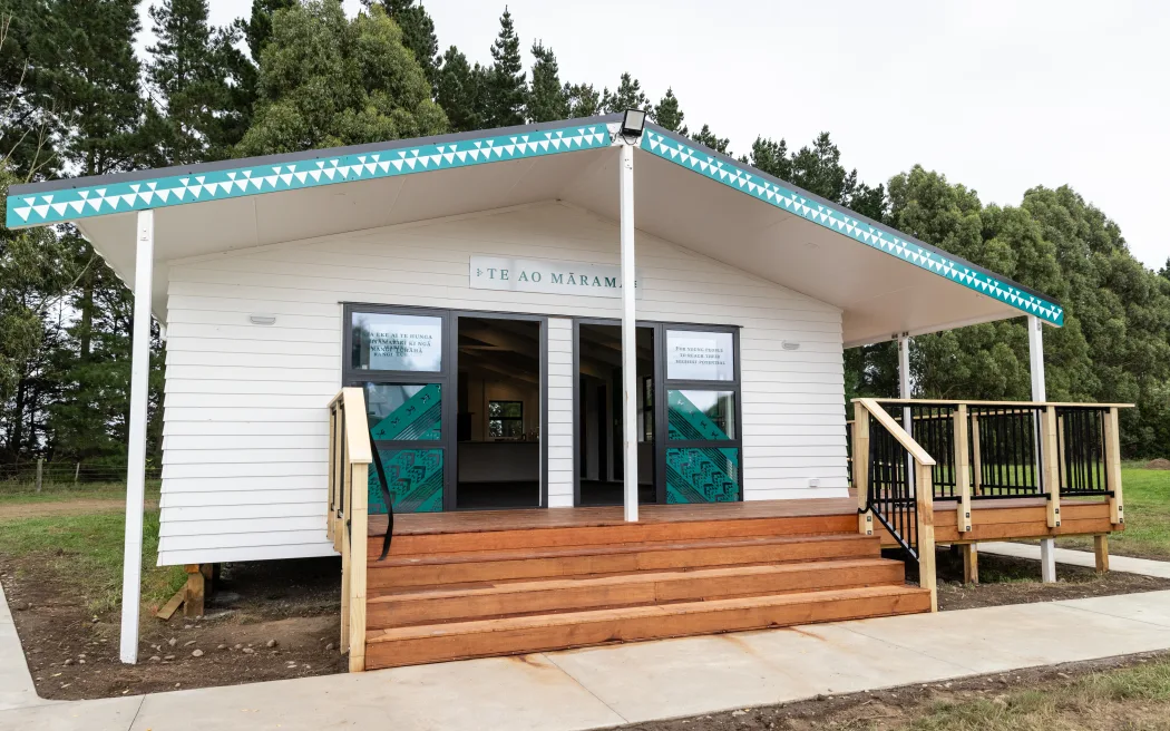
Te Ao Mārama whare manaaki exterior - tāniko maihi and entry steps
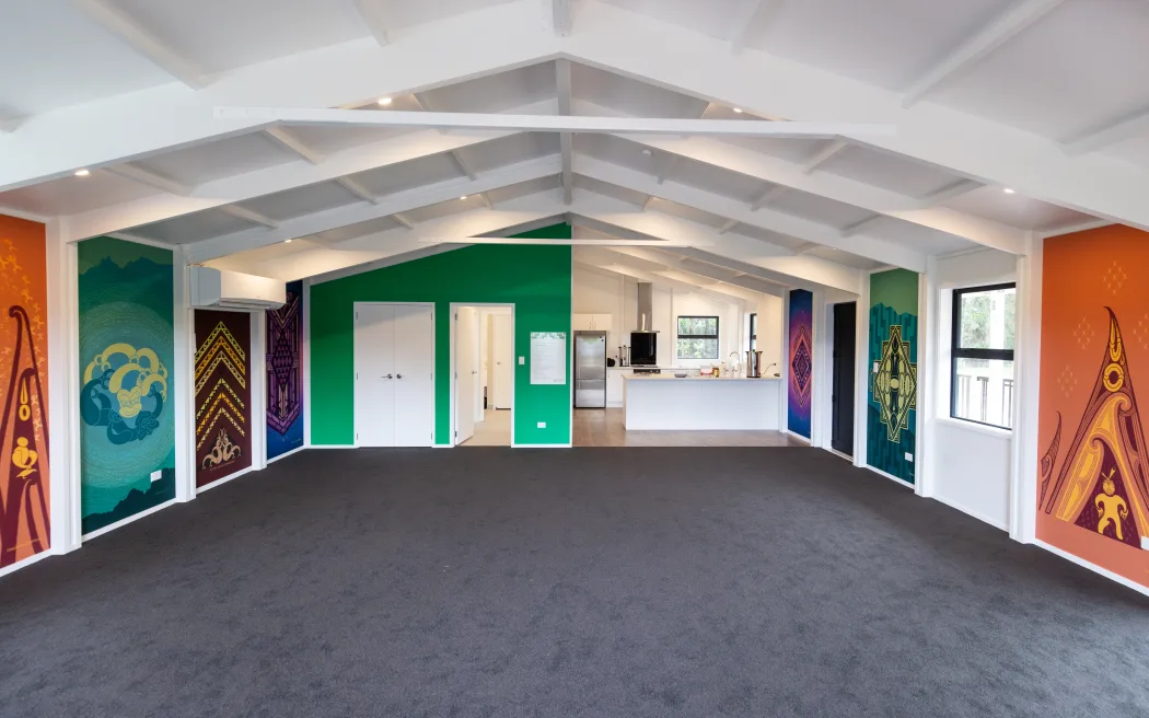
Whare manaaki interior - Tuakiritanga identity wall artworks lining the side walls
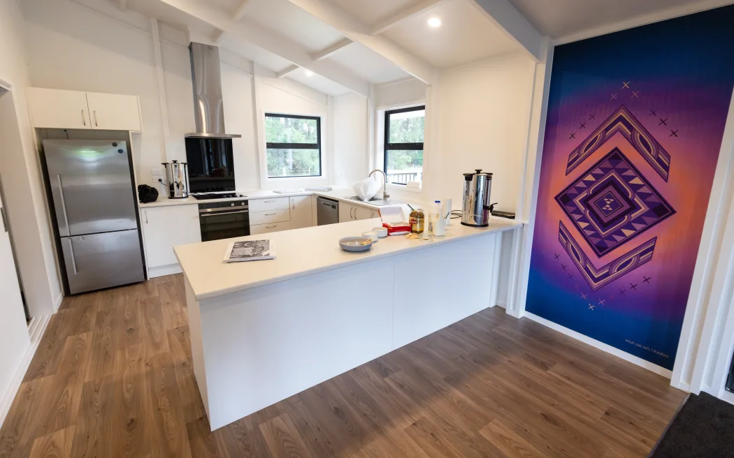
Kitchen and Kia Tipu, Kia Ora te Rangatahi artwork inside the whare manaaki
Toi Māori Design

Barnardos Aotearoa

Toi Māori design elements for a new Barnardos whare manaaki in Ōtautahi - a kaupapa Māori artwork programme, developed with mana whenua, that turns a care environment into a culturally affirming space of dignity, connection, and hope for rangatahi and their whānau.

Role

Visual DesignCultural StorytellingIP Creation & Story DevelopmentEnvironmental DesignStrategic Communication

Deliverables

  • Exterior whare artwork - tāniko across the maihi; taniko and haehae window frosting
  • Interior entrance artwork - poutama and tukutuku
  • Interior wall artwork series, including the Tuakiritanga identity wall
  • Culminating ninth artwork - Kia Tipu, Kia Ora te Rangatahi
  • Design, artwork production, and installation-ready files

Outcome

A whare manaaki transformed into a culturally affirming environment - one connected te ao Māori narrative across exterior, entrance, and interior surfaces, developed with mana whenua, intended to help rangatahi step toward restoration, support, and belonging.

Read full case study
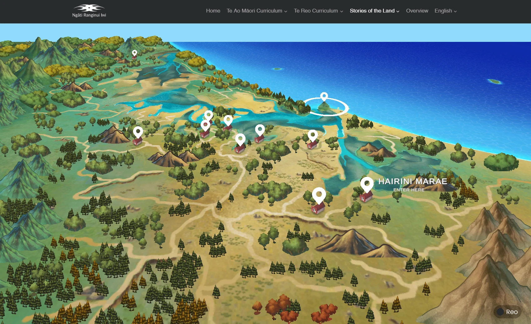
Stories of the Land interactive 3D map of Tauranga Moana
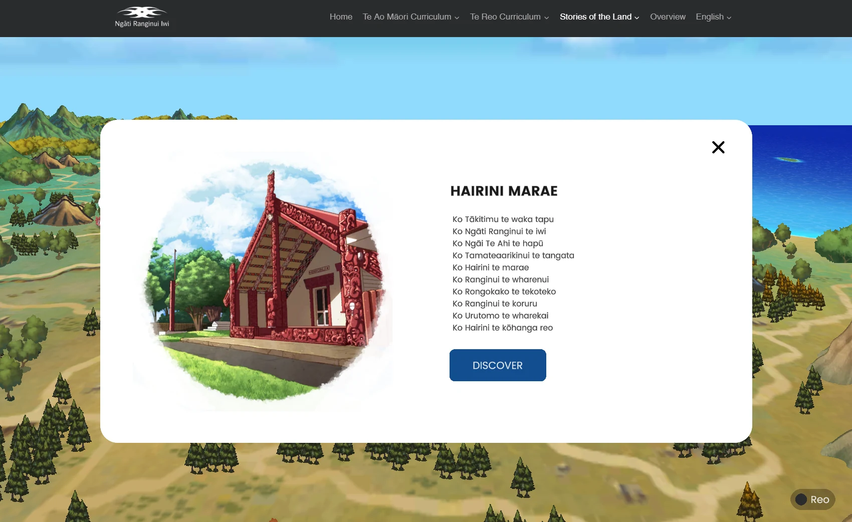
Hairini Marae location detail with whakapapa pepeha
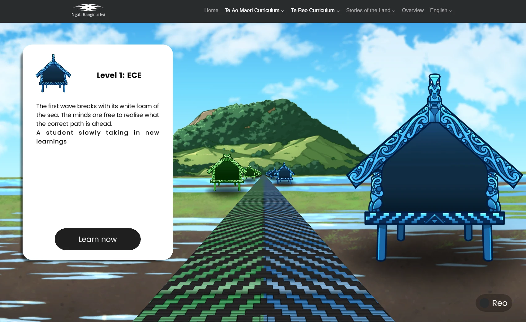
Te Reo Curriculum Level 1 ECE learning pathway
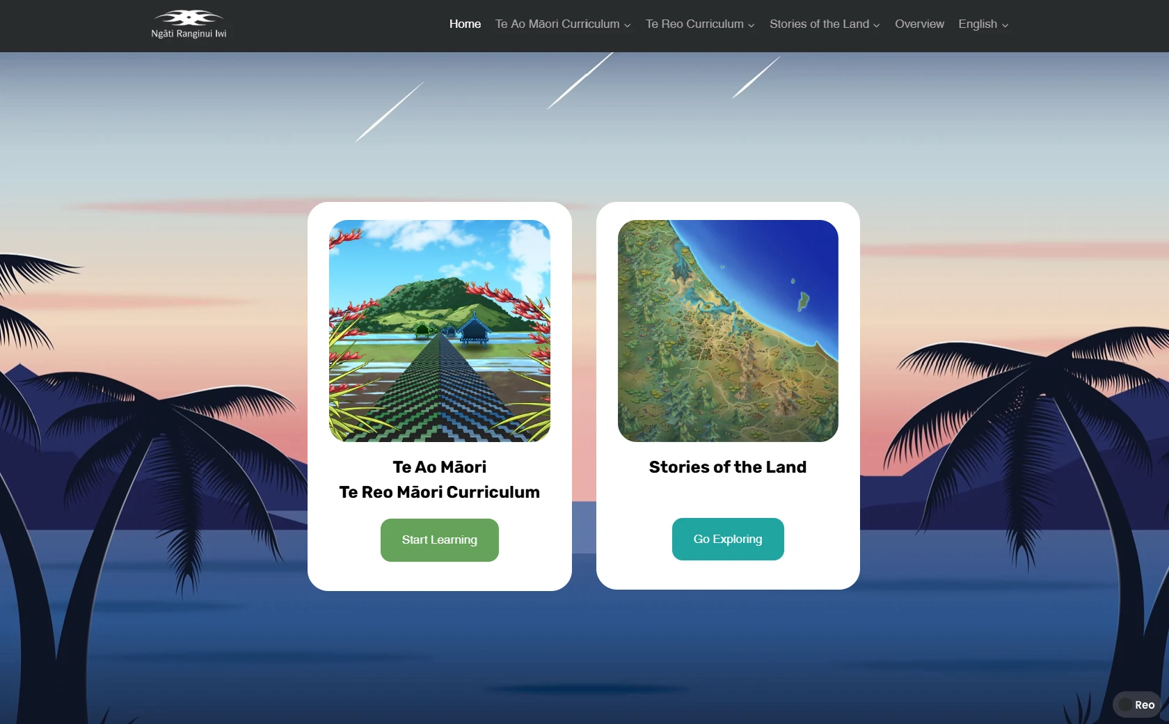
Ngāti Ranginui education platform home screen
Websites & Apps

Ngāti Ranginui

A 36-week website design and build for a significant Tauranga Moana iwi - a digital home that reflects the mana of Ngāti Ranginui while serving whānau across generations and digital literacies.

Role

Websites & AppsVisual DesignStrategic CommunicationCultural Transmission

Deliverables

  • Bespoke visual design system rooted in iwi identity and whakapapa
  • Content architecture co-designed with the iwi
  • Custom website build with CMS for iwi-administered content
  • Cross-generation accessibility and device compatibility
  • Content population and deployment

Outcome

Delivered a fully operational, culturally grounded website - giving Ngāti Ranginui a digital home with mana and administrative autonomy over their own digital presence.

Read full case study

Frequently asked

About Māori Graphic Design

How is Māori graphic design different from generic graphic design?
The design language, permission structure and cultural authority are treated as first-class inputs — not aesthetic flourishes at the end. Kaupapa, whakapapa and rights are agreed before design begins, and toi Māori elements are applied by artists with the mandate to use them.
Can you design bilingual (te reo Māori and English) systems?
Yes — bilingual and te reo–first typographic systems, publication design, wayfinding and brand collateral. We work with reo consultants on macron handling, tohutō and terminology.
Do you design brand identity for iwi and Māori entities?
Yes — brand strategy, tohu, wordmark, pattern system, typographic system, application guidelines and full brand delivery.

Craft your idea
into a clean
creative brief.

Walk us through your kaupapa using our guided intake tool. In five minutes, we'll have what we need to offer a clear path forward.

Project Request →