Mana Tāhuna Brand Identity
Mana Tāhuna Charitable Trust
A renewed visual identity and brand system for Mana Tāhuna Charitable Trust - a kaupapa Māori organisation rooted in Tāhuna (Queenstown), Whakatipu. Grounded in te ao Māori and the whenua, the system carries five distinct pou within one coherent brand language.
Role
Deliverables
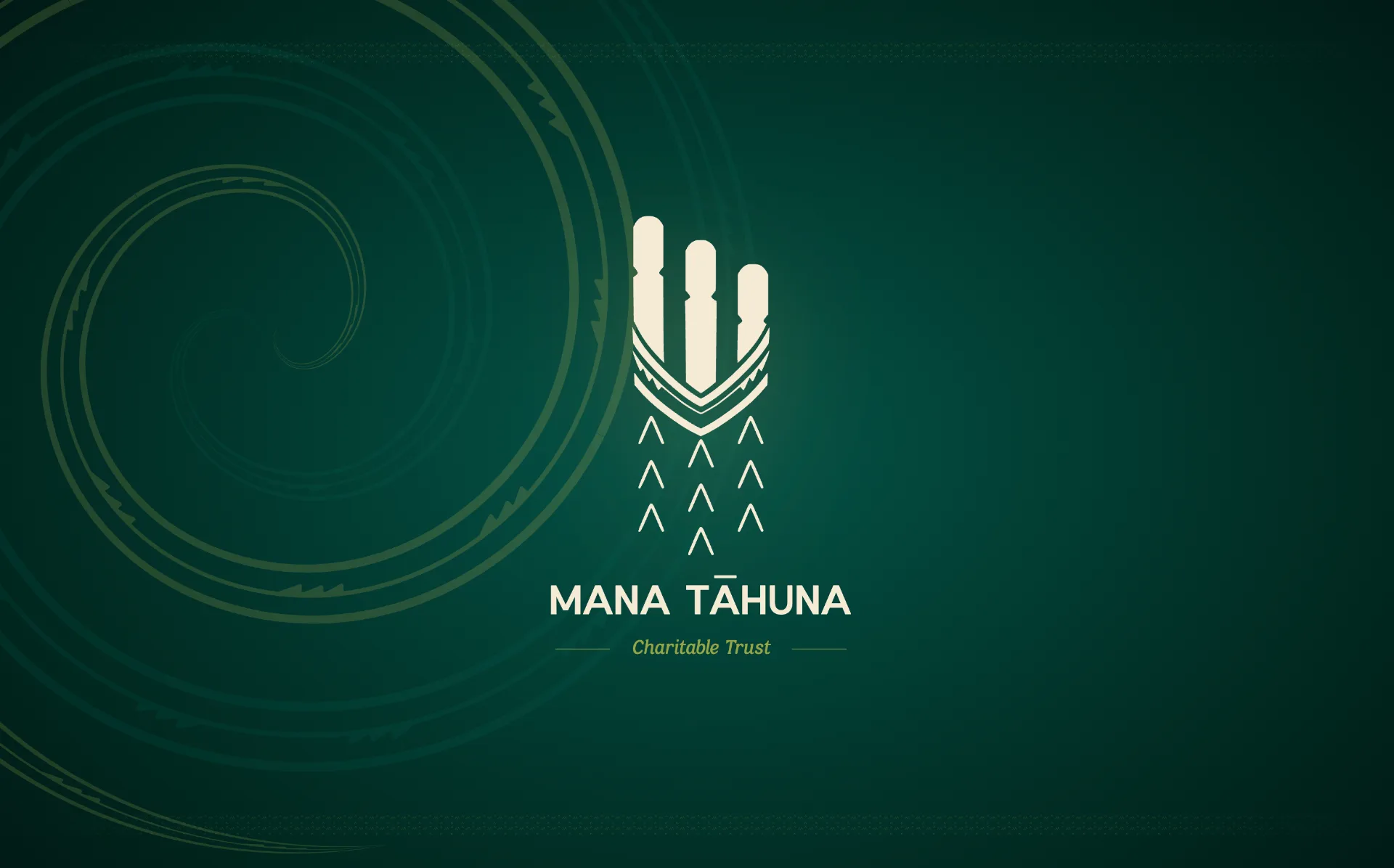
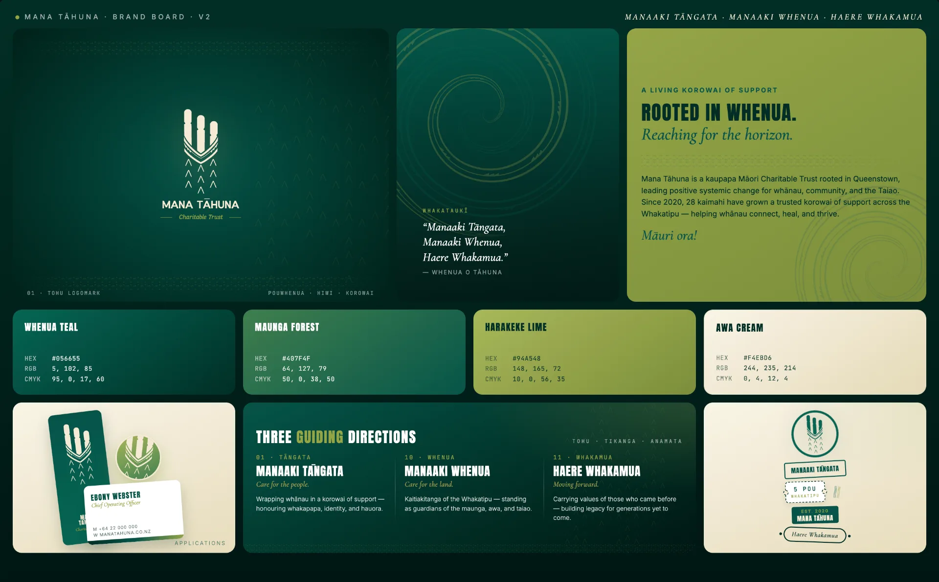
- Primary tohu drawing together pouwhenua, the hiwi of the waka taua, and the korowai
- Wordmark, full lockup, and standalone logomark
- Primary colour palette with monochromatic treatments and typography system
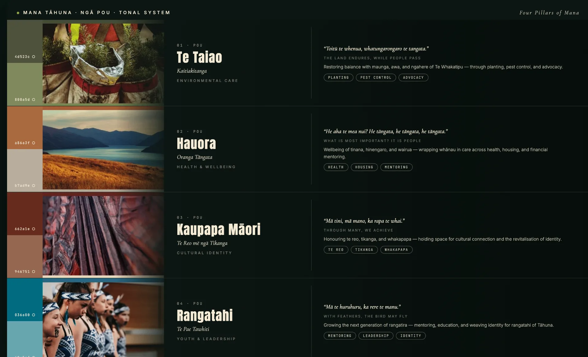
- Per-pou colourways for Te Taiao, Hauora, Kaupapa Māori, and Rangatahi
- Brand collateral - letterhead, digital watermark, pull-up banners, email signature, display picture, favicon
- Brand guidelines deck with alternative layouts and image-treatment guidance
Outcome
A cohesive kaupapa Māori brand system that honours whakapapa and place while signalling growth - flexible enough to express the trust's five pou through dedicated colourways, and ready for application across letterheads, banners, digital channels, and signage.
Project Overview
Mana Tāhuna is a kaupapa Māori Charitable Trust rooted in Tāhuna (Queenstown), leading positive systemic change for whānau, community, and the Taiao. Since establishing in 2020 it has grown into a trusted korowai of support across the Whakatipu, with 28 kaimahi helping whānau connect, heal, and thrive, and it operates across five interconnected pou: Hauora (health and social support), Te Taiao (environmental care), Kaupapa Māori (cultural), Rangatahi (youth), and Whakawhanake (development) (Mana Tāhuna, n.d.).
As the trust brought significant new kaupapa to fruition, its leadership recognised that this moment of growth called for more than programme development - it called for a renewed identity: one that honours where Mana Tāhuna has come from and reflects, with clarity and confidence, the organisation it is becoming.
The challenge was to build an identity grounded authentically in te ao Māori and the whenua of Tāhuna rather than a generic rebrand - an identity able to hold five distinct pou within one coherent system while carrying both heritage and forward momentum. To ensure cultural integrity, the trust's leadership (Michael Rewi, Kāi Tahu, and Ebony Webster, Ngā Puhi) engaged Toi Māori artist Renata Karena (Kāi Tahu) and designer Madison Henry-Ryan (Kāi Tahu) of Māui Studios to lead the conceptual development, so the mahi was shaped by hands connected to both the kaupapa and the whenua.
SOW Snapshot
Core Deliverables: Conceptual development led from the organisation's guiding whakataukī; a primary tohu (logomark) drawing together the pouwhenua, the hiwi (hull of the waka taua), and the korowai; wordmark, full lockup, standalone logomark, and supporting elements; a primary colour palette with monochromatic treatments; a typography system; per-pou colourways for Te Taiao, Hauora, Kaupapa Māori, and Rangatahi; brand collateral (letterhead and digital watermark, pull-up banners, email signature, display picture, favicon); alternative layouts and image-treatment guidance - delivered as a brand guidelines deck.
Cultural Foundation: The whakataukī Manaaki Tāngata, Manaaki Whenua, Haere Whakamua (care for the people, care for the land, moving forward together), and the visual themes of pouwhenua, korowai, and waka taua.
Audience: Mana Tāhuna whānau, community, and partners across the Whakatipu, spanning the trust's five service areas.
Format: Brand identity system and guidelines (print and digital).
Key Requirements: Cultural authenticity and connection to the whenua of Tāhuna, coherence across five pou, a balance of heritage and forward momentum, practical application across print and digital.
Service Connection: Visual Design, Brand Identity, Toi Māori Design, IP Creation and Story Development, Strategic Communication.
Outcomes
The identity began where it should - with the words that guide the organisation. From the whakataukī Manaaki Tāngata, Manaaki Whenua, Haere Whakamua, a set of rich visual themes emerged, and after hui the strongest - pouwhenua, korowai, and waka taua - were carried into toi Māori concept exploration led by Renata Karena.
Each element carries meaning: the pouwhenua speaks to presence and purpose, its three pou representing the core services of Te Taiao, Hauora, and Kaupapa Māori as markers of who Mana Tāhuna is; the korowai brings protection and shelter, wrapping around community and people; the raukura evokes the maunga ranges of Tāhuna, speaking to aspiration and the determination to grow; and symbolism drawn from the waka taua carries the narrative forward as collective motion, a reflection of Haere Whakamua.
The result is a cohesive identity system that honours whakapapa and place while signalling growth - a tohu and brand language rooted in the whenua of Tāhuna, flexible enough to express the trust's five pou through dedicated colourways, and ready for real-world application across letterheads, banners, digital channels, and signage. By placing Toi Māori artistry and Kāi Tahu connection at the centre of the process, the work demonstrates Māui Studios' ability to deliver kaupapa Māori brand identity with genuine cultural integrity rather than surface styling.
Impact Metrics
Intended Outcomes
- Give Mana Tāhuna a renewed identity that honours its origins and reflects its growth with clarity and confidence
- Express the trust's five pou within one coherent, flexible brand system
- Ground the identity authentically in te ao Māori and the whenua of Tāhuna
- Equip the organisation with a complete, practical brand toolkit for print and digital application
Broader Impact
- Supports a trusted community organisation - established in 2020 and grown to 28 kaimahi across the Whakatipu - to present itself with mana as it scales its kaupapa across hauora, taiao, rangatahi, and leadership (Mana Tāhuna, n.d.)
- Models kaupapa Māori brand development led by people connected to the kaupapa and the whenua, ensuring cultural integrity is built in from the first concept
- Strengthens Māui Studios' positioning in toi Māori-led brand identity for iwi, hapū, and kaupapa Māori organisations
Future Opportunities
- Rollout across the trust's digital presence, signage, vehicles, uniforms, and physical sites
- Sub-brand systems for each pou and major programmes
- Templated collateral for ongoing campaigns and reporting
- Animated and motion versions of the tohu for digital and screen
- A living brand guidelines resource that grows with the organisation
References
- Mana Tāhuna. (n.d.). Mana Tāhuna Charitable Trust. https://www.manatahuna.co.nz